LLM Call Success Rates
This chart gives you a visual overview of your LLM call performance over time, showing you precisely when calls are successful.
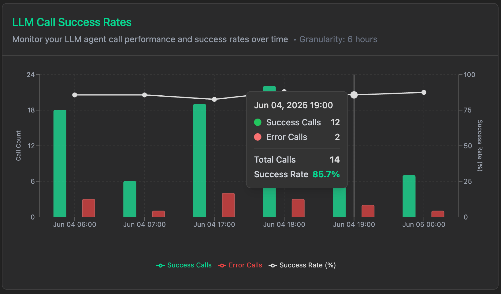
The success rates chart shows your LLM agent call performance and success rates over your selected time period. Both call volume and reliability can be tracked in one view.
- Green Bars: Represent the number of successful calls per time interval
- Red Dots: Represent any error calls (though they may not always be visible if error rate is low)
- White Line: Tracks your success rate percentage over time
- Dual Y-axis: Left axis represents call counts, right axis represents success rate percentage
Reading the Data
The graph is laid out to easily spot patterns:
- Call Volume: Bar heights show how busy your system was at different times
- Success Trends: White line shows if your success rate is steady or changing
- Time Patterns: See when your system is busiest and how regular it is during peak times
- Problem Spots: Dips in success rate line or red error markers help you spot issues
Key Benefits
LLM Call Success Rates chart helps you:
- Track performance trends: See if your success rates are improving or declining over time
- Identify problem periods: Spot exactly when issues occurred and correlate with system events
- Monitor call patterns: Understand when your LLM gets used most
- Verify improvements: Check if optimizations and fixes are actually working
- Debug issues: Use timeline data to investigate specific incidents
- Keep the plan up to date: Schedule updates during periods of inactivity